Images
Images are one of the core block types in the editor. Add them to any section, then fine-tune framing, captions, alt text, links, and card styling from the image panel.
Add an image
Open a section and use the + add-block control, then choose Image. New images land in your media library and on the canvas. You can also reuse an image you've already uploaded from the Media panel (see Managing media below).
The image panel
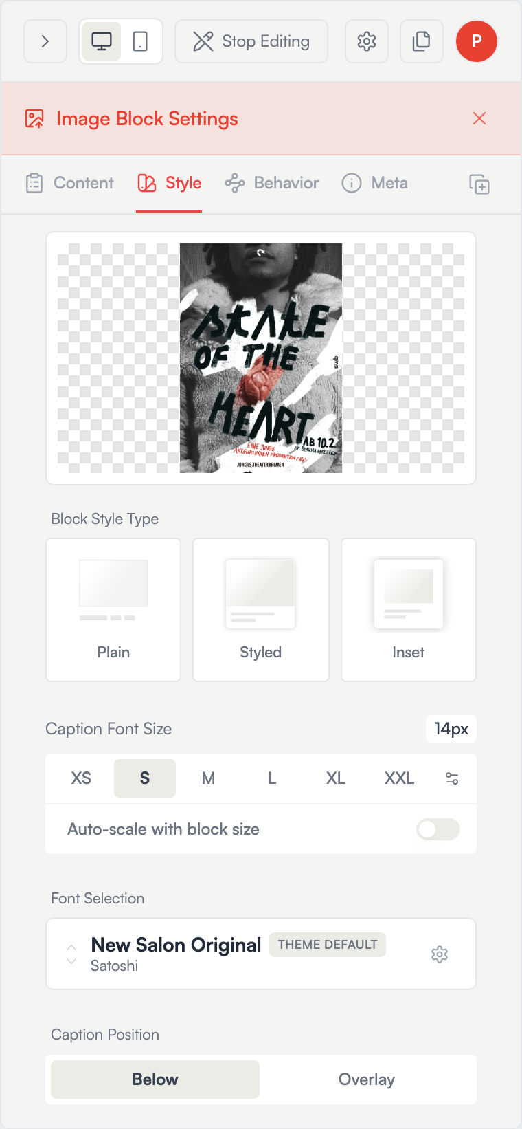
Click an image and open its edit panel. The panel has four tabs:
- Image — preview, aspect ratio, caption, file info
- Style — card styling and image card themes
- Meta — title, secondary text, alt text
- Behavior — click action (link/lightbox), hover effects
Use the duplicate button (top-right of the tab row) to copy the block — same image, same styling — into the section. The duplicate points at the same file, so it doesn't use extra storage.
Image tab
The preview sits at the top. From here you can:
- Rotate — click the rotate icon to preview a 90° turn, then Apply to save the rotation permanently. Cancel with the ✕ to discard.
- Download — save the original file.
- Aspect Ratio — choose Original, 16:9, 4:3, 1:1, or 9:16. Original lets the image's natural proportions drive the layout.
Below the preview:
- SVG Colors — only appears for
.svgfiles. Toggle Use Original Colors off to set a custom color and hover color. - Image Caption — a rich-text field (headings, bold, italic, lists, links). Use Set as default caption for this image to reuse the caption automatically the next time you place the same image.
- Image Info — dimensions, file size, and filename.
There's no separate crop tool — use Aspect Ratio to control framing, or the card's object-fit behavior in the Style tab.
Meta tab
- Image Title — a display title for the image.
- Secondary Text — a subtitle, credit, or extra line.
- Alt Text — describes the image for screen readers and search engines. Always worth filling in for accessibility and SEO.
Behavior tab
Click Action sets what happens when a visitor clicks the image:
| Option | Result |
|---|---|
| Lightbox | Opens the image full-screen in a lightbox (default) |
| Page | Links to another page on your site |
| URL | Links to any external address |
| None | Clicking does nothing |
For Page and URL links you can toggle Open in new tab.
This tab also holds hover effects:
- Hover Effect — None, Lift, Zoom, or Filter. Choosing Filter reveals sliders for Brightness, Contrast, Saturation, and Blur, with separate Initial and Hover states.
- Caption Hover Effect — None, Color, Show (caption hidden until hover), or Hide (caption shown until hover).
Style tab
The Style tab is where you shape the image card — corners, borders, shadows, caption placement, and colors. Apply a polished look in one click using the built-in image card themes:
| Theme | Look |
|---|---|
| Plain | Just the image, no caption styling |
| Caption Below | Image with the caption underneath |
| Subtle Overlay | Caption on the image with a transparent background |
| Card Style | Image and caption in a bordered card |
| Minimal | Clean image with a small caption |
To copy your styling across the section, use Apply to Section in the tab footer. Reset to Site Theme clears block-level overrides so the image follows your site theme again. You can also save the current look as a reusable preset.
Managing media
The Media panel lists every image and video you've uploaded. Use the filter row to narrow the view:
- This Section — assets used in the current section, in order.
- This Page — assets used anywhere on the current page.
- Other Pages — assets used elsewhere on this site.
- Unused — assets not placed in any of your sites.
Search by filename, and switch between grid and list views. Hover an asset to Add it to the current section or, in the Unused view, Delete it. Delete all unused removes every asset not used in any of your sites — this can't be undone.
Going live
Image edits save automatically and appear on your published site within a few seconds. Click Stop Editing (or the Preview pencil in the floating toolbar) to see them as visitors do.
See also: Editor basics · Text blocks · SalonEngine layouts