Page Blocks
A page block turns one of your pages into a clickable card. It shows the page's cover image, title, and caption, and links straight to that page when a visitor clicks it. Use page blocks to build index pages, portfolio grids, or "browse my work" sections that link out to deeper pages.
Add a page block
- In the editor, open the ••• menu on the toolbar and choose Browse Pages.
- Pick the page you want to link to.
The block appears as a card. If you add a page block without choosing a page yet, it shows a Select a page placeholder — click it to choose which page to display.
The card always links to the page it points to, so your title, caption, and cover image stay in sync with that page.
The cover image
Each page block pulls its image from the linked page. Under Cover Source you choose which image to use:
| Source | What it shows |
|---|---|
| Auto | Uses the page's cover image, falling back to its Social Preview Image when there's no cover. |
| Cover | Always uses the page's cover image. |
| OG | Always uses the page's Social Preview Image (the OG Image set on the Page panel). |
Set the page's cover image from the linked page itself — use the Linked shortcut at the top of the panel to jump there.
Cover aspect ratio
Under Cover Aspect Ratio, choose how the cover image is cropped:
- Original — keeps the image's natural proportions
- 16:9, 9:16, 4:3, 1:1 — forces a fixed ratio
On the Canvas layout, changing the ratio also resizes the card to match.
Show or hide elements
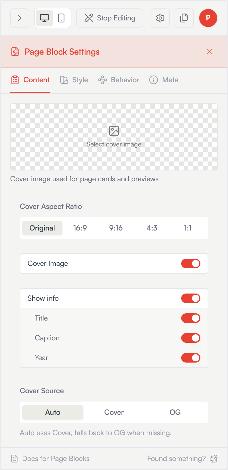
Under Show Elements, toggle each part of the card on or off:
- Cover Image
- Title
- Caption
Hide what you don't need — for example, turn off the title and caption for an image-only grid.
Caption
The caption is edited on the page block with the same rich-text editor used elsewhere (headings, bold, italic, lists, links). The caption is shared across linked-page cards — it's stored on the linked page, so every page block pointing to that page shows the same caption, and editing it updates all of them.
Styling
Open the Style tab to change the card's look:
- Card background, border, corner radius, and shadow
- Title and caption typography and color
Page cards ship transparent with no border — opt into a background or border through the Style tab. Use Apply to Section to copy your style to every other page block in the same section, save it as a preset, or Reset to Site Theme to clear overrides.
Behavior
The Behavior tab controls hover interactions:
- Hover Effect — None, Lift, or Zoom for the whole card
- Caption Hover Effect — None, Color, Show, or Hide (shown only when the caption is visible). Choosing Color reveals text and background hover-color pickers.
Drafts and missing pages
- If the linked page is a draft, the card shows dimmed with a Draft badge in the editor and is hidden from visitors until you publish the page.
- If the linked page is deleted, the card shows Page not found in the editor so you can delete or repoint it.
Going live
Changes save as you make them and appear on your published site within a few seconds. Click Stop Editing (top bar) or the Preview pencil icon on the floating toolbar to see them as visitors do.
Related: Pages · Image Blocks · Layouts